
Leading Economic Noise
Mish Moved to MishTalk.Com Click to Visit.
The Conference Board released the Leading Economic Indicators for October 2006 on November 20th.
Here are the highlights:
- The U.S. leading index increased 0.2 percent
- The coincident index increased 0.1 percent
- The lagging index increased 0.2 percent

Click on chart for a better view.
The two single biggest predictors of a recession are an inverted yield curve and declining housing permits but the table above shows that those two combined account for a mere 12.85% of the composite score while Money Supply (M2) single handedly accounts for a whopping 35.35% of the composite index.
Inquiring minds might be asking what effect M2 had on the composite index increasing by .2%.
But why stop there?
Following is the complete breakdown:

Click on chart for a much better view.
Consumer Expectations
Let's start off by dismissing complete silliness.
Consumer expectations are given more weight than housing permits.
Does anyone think consumers do what they say? I have been watching consumer sentiment for 5 years now and all I see is random noise. The most recent noise had consumer sentiment rising with the fall in gasoline prices. Consumer expectations added .30 to the index last month and .19 to the index this month. Everyone expected consumer sales to dramatically increase with the rise in consumer sentiment and the drop in gasoline prices.
What actually happened was that consumer credit plunged and consumer spending was anemic. Yet for some reason consumer expectations have a weighting of 2.91% vs. a weighting of 2.66% for housing permits and 1.86% for manufacturer's new orders. Does this make sense to anyone?
M2 as a Leading Indicator
I am most intrigued by the weighting of 35.35% given to M2. M2 added .43% to the composite total of .2%. Following is a chart of M2 Money Stock (left axis) and M2 Annualized Period Gains (right axis) since 1959, with recession periods in pink.

Click on chart for a much better view.
I am trying to figure out what if anything the above chart is saying.
The chart shows M2 spikes coming out of recessions three times, spikes in recessions twice, and nothing extraordinary once. We can also see the 1994 "soft landing" spike low.
The chart also shows enormous whipsaws in both directions outside the normal ranges in 2000, 2001, and 2003 (and also 1966-1967, 1986-1987, 2005-2006). In other years the overall series seems to jerk around with relatively high volatility between a smaller band of +2.5% to +10.0% and a larger band of +0.0% to +15.0%. with spikes on each side but way higher on the upside than the downside. On the left axis one can take a look an pretty much see that M2 goes up every year unabated.
For some reason the M2 series is given the highest weighting in leading indicators.
Housing Starts
Compare the above chart with the following chart of housing starts (once again with recessions in pink).
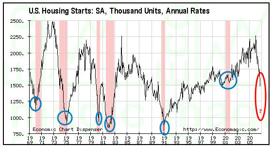
Yes I realize permits are the leading indicator and I used housing starts, but I used the charting service I had that could easily show recession periods. Anyway, which chart looks like it deserves more weighting? Notice that we are not even in recession yet, so who knows how low starts will go.
Yield Curve
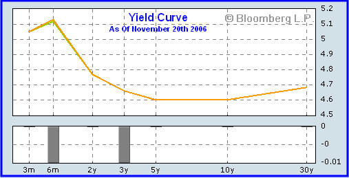
Although the U.S. is not in recession (officially anyway) the massively inverted yield curve and housing starts are most assuredly predicting it.
Crisis of Excess Liquidity
The third biggest positive contributor to the index of leading indicators is the stock market. But I look at mergers, leveraged buyouts, volatility, and debt offerings at amazingly low spreads vs. treasuries (just to buy back stock) not as a leading indicator but rather as proof that we are in a "Crisis of Excess Liquidity". Does anyone seriously think recent stock market action is in any way shape or form, normal?
Merger Mania
Fil Zucchi on Minyanville offered these comments on the recent feeding frenzy in an article titled "If You Want It This Bad You Can Have It".
And so the frenzy continues. Freeport McMoran (FCX) swallows Phelps Dodge (PD) for a cool $27 billion. This makes FCX a copper company rather than a gold company with copper interests. The potential buy-out of PD had been kicked around for a number of months and even the premium is in the speculated range. Time will tell if this one works out, suffice to say this is a large bet that copper has not yet seen peak prices, or else FCX will find itself in a world of pain.A bell seldom rings at the top or the bottom but that bell is ringing loud and clear now. Commercial real estate has peaked (give or take a few months). To be fair, I have been bearish on commercial real estate for a long time. But I have never once shorted that sector. Instead I have simply stood back in awe watching commercial REITs rise and rise and rise.
Let’s move on to Blackstone for Equity Office Property (EOP) (assuming that the WSJ speculation is correct) because when thrown in with CB Richard Ellis (CBG) buying Trammell Crow (TCC), and the Reckson Assoc. (RA) / SL Green Realty (SLG) merger, it is bringing the action in commercial real estate to a fever pitch.
What cannot be embellished is the fact that one of the shrewdest commercial players ever, EOP’s founder Sam Zell is bailing out; and perhaps the quintessential blue blood, old fashioned real estate outfit - Trammell - has unloaded itself to the CBG’s "cowboys." If this is not the second coming of Julian Robertson folding Tiger Management right at the 2000 market peak, then this time it must be different.
This latest feeding frenzy smacks of the same mania that had AOL taking under Time Warner (yes taking under is the correct word) and JDS merging with Uniphase in 1999 forming JDSU.
JDS Uniphase stock was a high-flyer tech stock investor favorite. Its stock price doubled three times and three stock splits of 2:1 occurred roughly every 90 days during the last half of 1999 through early 2000, making millionaires of many employees who were stock option holders, and further enabling JDS Uniphase to go on an acquisition and merger binge. After the telecom downturn, JDS Uniphase announced in late July 2001 the largest (up to then) write-down of goodwill and business losses in business history: $45 billion. Employment soon dropped as part of the Global Realignment Program from nearly 29,000 to approximately 5,300, many of its factories and facilities were closed around the world, and the stock price dropped from $153 per share to less than $2 per share.No, I do not expect any declines that dramatic this go around, but the warning signs are flashing red for sure. On a fundamental basis it makes sense for commercial real estate to peak six months to a year after residential real estate peaks and Zell has to know it. New housing subdivisions go up creating urban sprawl and all sorts of strip malls and commercial real estate follow with a lag. With consumers throwing in the towel and a recession predicted by the two best indicators around, Zell is smelling a top or close to it.
One thing these mergers, leveraged buyouts, and stock buybacks financed by debt do is pump up broad money supply. One can either believe that activity or one can believe housing permits and the inverted yield curve. Bear in mind we saw the same type of merger mania action in 2000 right before the Nazcrash. Is history about to repeat?
Note: Leading Economic Noise will be one of the subjects of my next podcast on HoweStreet. If you have not yet seen the HoweStreet video interview with Marc Faber on November 14th you might want to check that out too.
Mike Shedlock / Mish
http://globaleconomicanalysis.blogspot.com/


